VitalFlo

Healthcare in action

Capabilities
UX/UI Visual Design

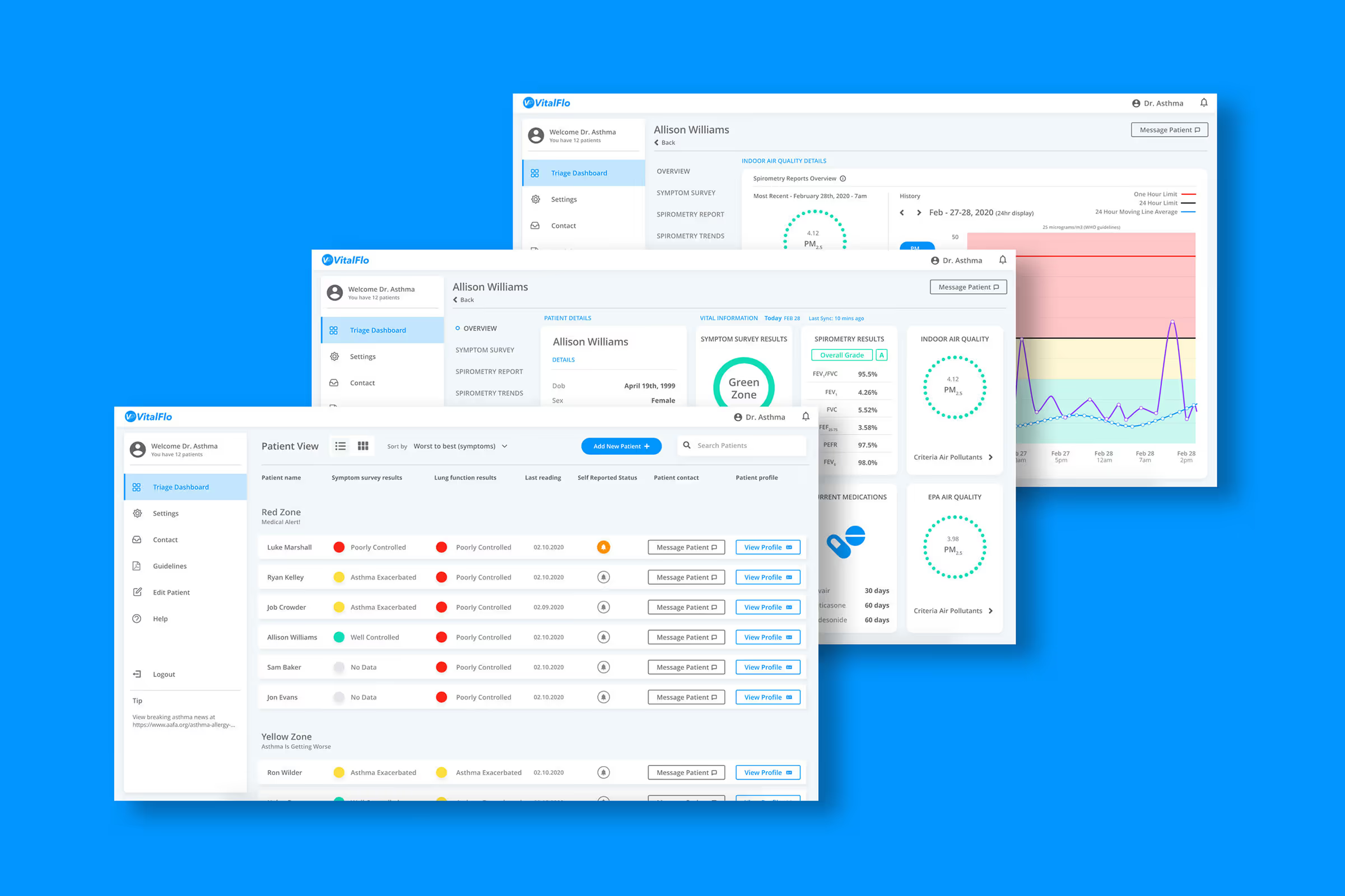
VitalFlo is a digital health company focused on reducing risk of asthma attacks in the US’s most vulnerable populations. For their initial product, VitalFlo partnered with Trig to design a clear, compelling clinical portal experience driven by stakeholder feedback.  

Challenge

Detecting small changes

VitalFlo understands it’s difficult for patients to detect small changes in their condition. This insight drives their mission to track asthma attack risk factors, equipping physicians with data to intervene before patients end up in the emergency room. VitalFlo’s home monitoring system combines local air quality data along with the patient’s lung function, symptoms, and medication use to provide a holistic picture of respiratory health.

The challenge is that this also generates a considerable influx of new data for physicians to consider. A team member explained, “We have decades of research that says the environmental data is important, it just isn't being delivered to the clinical practice in any meaningful way”. To achieve their promise of effective, personalized care plans, VitalFlo needed to develop an analytics tool that wasn’t a burden for care teams.

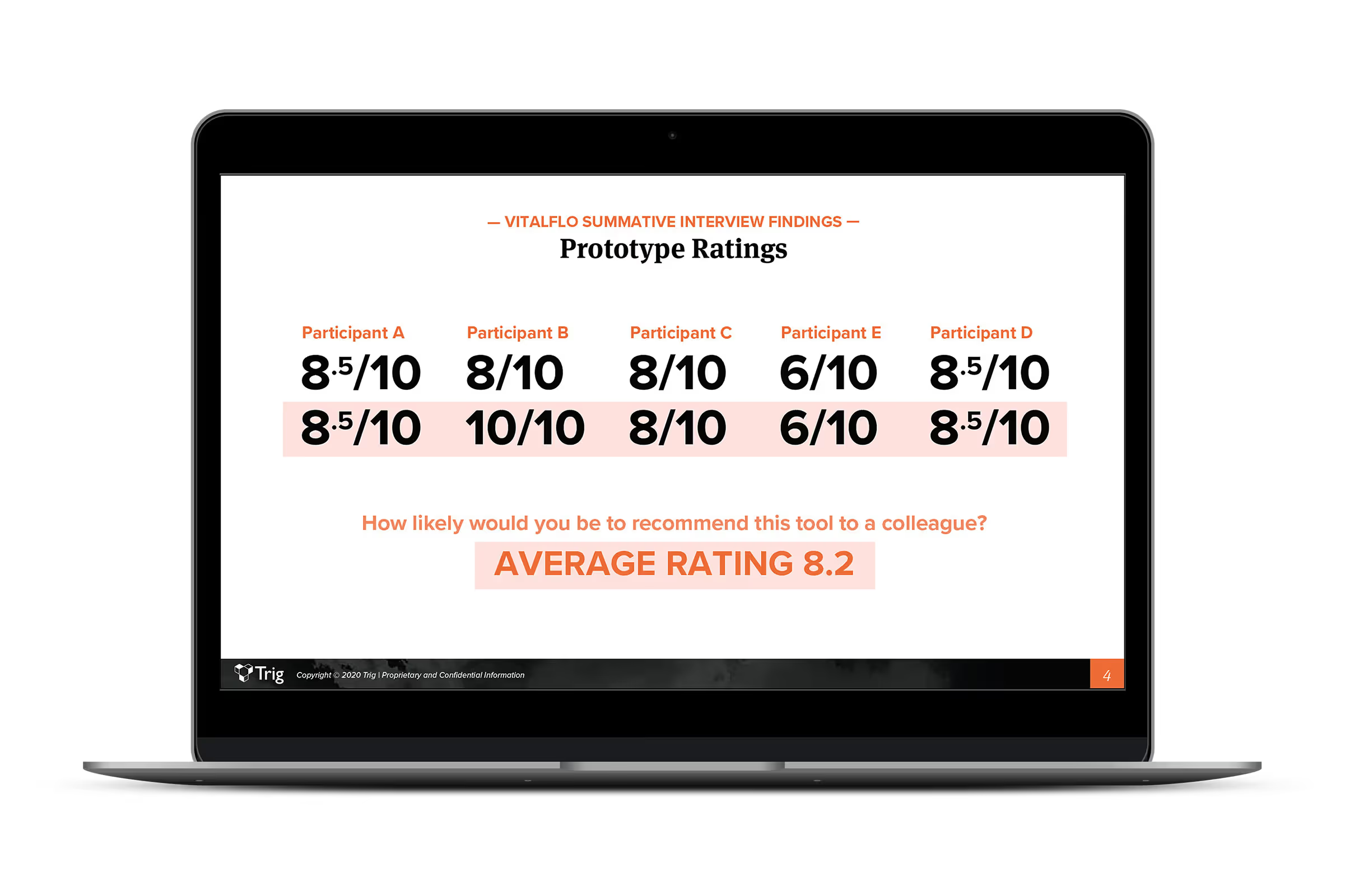
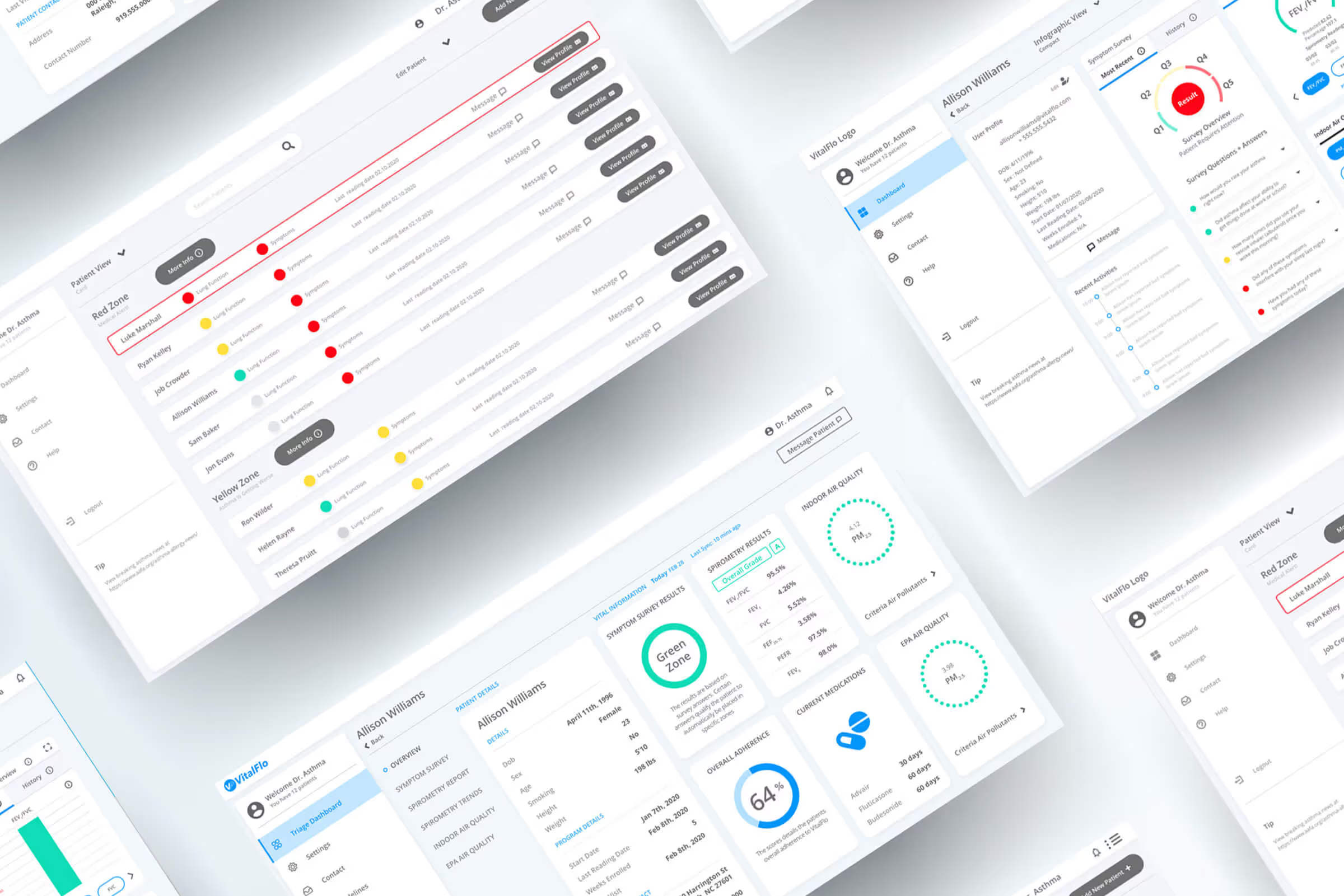
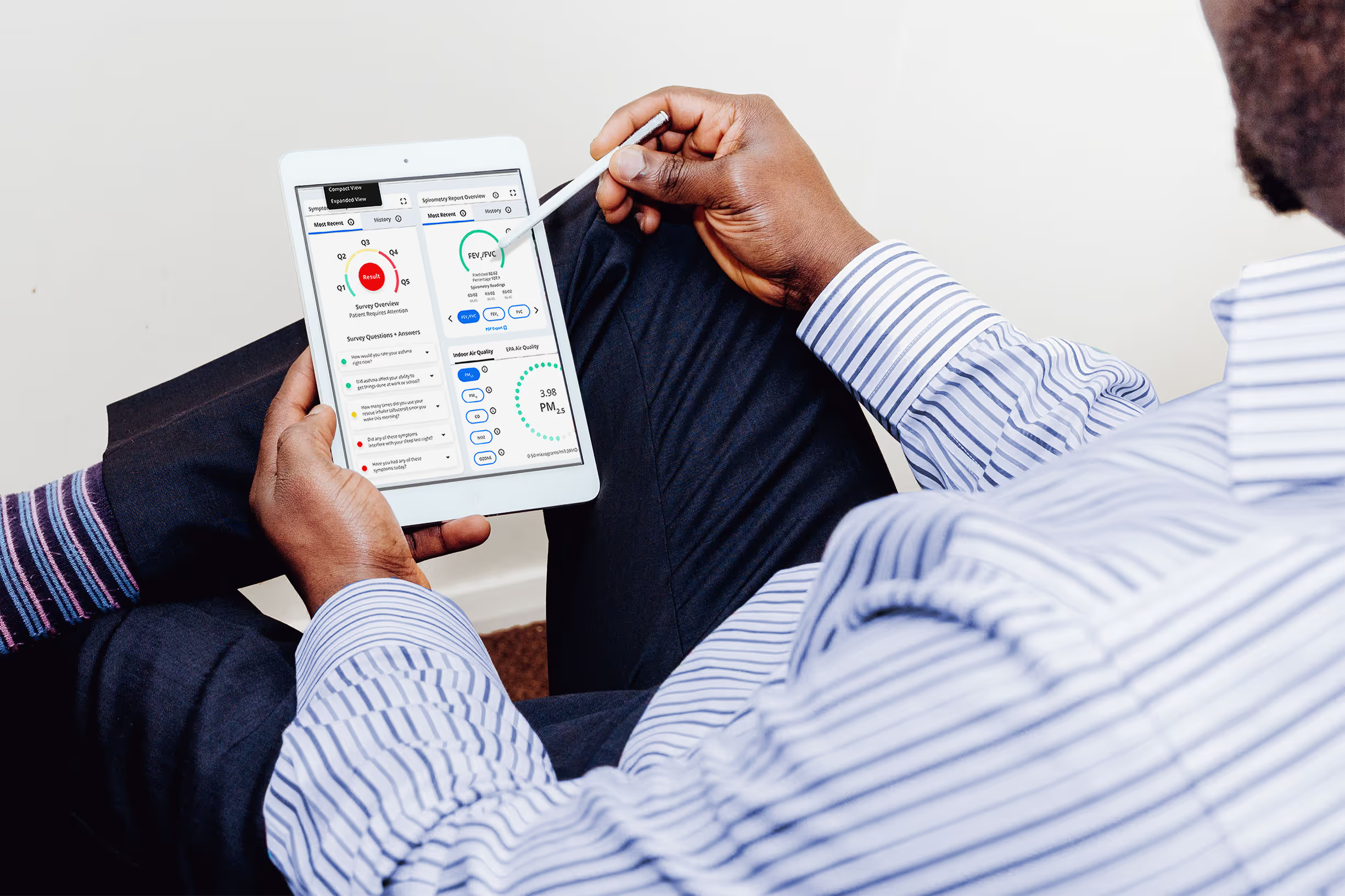
VitalFlo approached Trig to create a physician portal design guide informed by stakeholder feedback. Our research needed to confirm that physicians believed the right info was easily accessible, intuitive, and trustworthy. The end deliverable would serve as a clear visual and interactive guide for the back-end app development process.

Approach

Exploring the entire journey

Our first touch point set up VitalFlo’s pivot from consumer hardware to clinical software. Trig presented a competitive analysis of spirometers and companion apps, highlighting the availability of FDA-approved devices on the market. When VitalFlo subsequently changed course, our digital UX/UI design capabilities meant we could pivot with their team toward a more commercially viable path.

We started by discussing new UX goals as a team, pinpointing features of our portal prototype that needed to understood from the physician’s perspective. This was crucial for our researchers to create a semi-structured interview guide that maximized precious time with subject matter experts.

Next, Trig conducted video call interviews with general physicians, asthma specialists, and respiratory therapy nurses; one researcher focused on leading discussion while the other took notes and followed up with clarifying questions. At the end of the first wave, we organized comments from each interview into bright spots and roadblocks to adoption. Trig presented these insights in a summary to VitalFlo, who quickly approved implementation.  Our research and UX teams worked seamlessly to incorporate feedback into a new design for the next wave of interviews.  

The second interviews were structured to hone in on navigation and usability, steering conversation toward tactical feedback. Our researchers synthesized all that qualitative data into recommendations to shed unnecessary elements and fine-tune communication of key data. In a short period of time, Trig arrived at a UX/UI design guide that gave VitalFlo confidence as they launch into a broader market.

Explore

No items found.
No items found.

Prototype

No items found.
No items found.

Build

No items found.
No items found.
“The clinician interviews were especially helpful in my product management role. We got a lot of valuable feedback that helped us better align our product roadmap to what the end users need.”
Ryan Kelly
Head of Product | VitalFlo
Result

Final thoughts

Trig’s clinical interviews uncovered what mattered most to physicians. And since our design team includes experts in UX and research, we could quickly iterate and implement before the next round of interviews.  The result was a streamlined digital tool that improves physician-patient communication, keeping high-risk asthma sufferers out of the ER.

Additional Quotes
VitalFlo

Healthcare in action

Capabilities
UX/UI Visual Design

VitalFlo is a digital health company focused on reducing risk of asthma attacks in the US’s most vulnerable populations. For their initial product, VitalFlo partnered with Trig to design a clear, compelling clinical portal experience driven by stakeholder feedback.  

Challenge

Detecting small changes

VitalFlo understands it’s difficult for patients to detect small changes in their condition. This insight drives their mission to track asthma attack risk factors, equipping physicians with data to intervene before patients end up in the emergency room. VitalFlo’s home monitoring system combines local air quality data along with the patient’s lung function, symptoms, and medication use to provide a holistic picture of respiratory health.

The challenge is that this also generates a considerable influx of new data for physicians to consider. A team member explained, “We have decades of research that says the environmental data is important, it just isn't being delivered to the clinical practice in any meaningful way”. To achieve their promise of effective, personalized care plans, VitalFlo needed to develop an analytics tool that wasn’t a burden for care teams.

VitalFlo approached Trig to create a physician portal design guide informed by stakeholder feedback. Our research needed to confirm that physicians believed the right info was easily accessible, intuitive, and trustworthy. The end deliverable would serve as a clear visual and interactive guide for the back-end app development process.

Process

Exploring the entire journey

Our first touch point set up VitalFlo’s pivot from consumer hardware to clinical software. Trig presented a competitive analysis of spirometers and companion apps, highlighting the availability of FDA-approved devices on the market. When VitalFlo subsequently changed course, our digital UX/UI design capabilities meant we could pivot with their team toward a more commercially viable path.

We started by discussing new UX goals as a team, pinpointing features of our portal prototype that needed to understood from the physician’s perspective. This was crucial for our researchers to create a semi-structured interview guide that maximized precious time with subject matter experts.

Next, Trig conducted video call interviews with general physicians, asthma specialists, and respiratory therapy nurses; one researcher focused on leading discussion while the other took notes and followed up with clarifying questions. At the end of the first wave, we organized comments from each interview into bright spots and roadblocks to adoption. Trig presented these insights in a summary to VitalFlo, who quickly approved implementation.  Our research and UX teams worked seamlessly to incorporate feedback into a new design for the next wave of interviews.  

The second interviews were structured to hone in on navigation and usability, steering conversation toward tactical feedback. Our researchers synthesized all that qualitative data into recommendations to shed unnecessary elements and fine-tune communication of key data. In a short period of time, Trig arrived at a UX/UI design guide that gave VitalFlo confidence as they launch into a broader market.

No items found.
No items found.
Solution

Finalizing the process

Choosing remote-friendly virtual tools allowed us to collaborate at each step without losing time for travel. Trig set up each iteration of the click-through prototype, interview guide, and design recommendations report so that VitalFlo could easily review and comment when it suited their schedule. As Trig facilitated physician interviews, some VitalFlo members joined our team incognito to ask follow-up questions directly.  Interviews were recorded with participant permission so everyone at VitalFlo had the opportunity to observe reactions first-hand.

When other businesses transitioned to virtual or paused during the early weeks of coronavirus shelter-in-place orders, Trig’s research continued on schedule.  Our interview tools were selected to fit into the busy physician’s schedule, so if the only moment available was in the parking lot at the end of their shift, we were prepared.

However, our conversations uncovered another problem for time-poor physicians. The current prototype required care teams to log into the portal to view their triaged list of patients, and highlighted patients who recently contacted their physician’s practice.  Interviewees explained that most patients call if they’re having trouble, so they saw more value when the dashboard told them something their patient wasn’t aware of.

Physicians did differ on the alert parameters they wanted to set, the populations they would set them up for, and how they wanted to receive notifications. To maximize adoption, Trig’s research team recommended adding a new customizable alert feature that physicians can quickly set to their preferences.

“The clinician interviews were especially helpful in my product management role. We got a lot of valuable feedback that helped us better align our product roadmap to what the end users need.”
Ryan Kelly
Head of Product | VitalFlo
Result

Final thoughts

Trig’s clinical interviews uncovered what mattered most to physicians. And since our design team includes experts in UX and research, we could quickly iterate and implement before the next round of interviews.  The result was a streamlined digital tool that improves physician-patient communication, keeping high-risk asthma sufferers out of the ER.
Additional Case Studies

VitalFlo

Healthcare in action

Capabilities
UX/UI Visual Design

VitalFlo is a digital health company focused on reducing risk of asthma attacks in the US’s most vulnerable populations. For their initial product, VitalFlo partnered with Trig to design a clear, compelling clinical portal experience driven by stakeholder feedback.  

Challenge

Detecting small changes

VitalFlo understands it’s difficult for patients to detect small changes in their condition. This insight drives their mission to track asthma attack risk factors, equipping physicians with data to intervene before patients end up in the emergency room. VitalFlo’s home monitoring system combines local air quality data along with the patient’s lung function, symptoms, and medication use to provide a holistic picture of respiratory health.

The challenge is that this also generates a considerable influx of new data for physicians to consider. A team member explained, “We have decades of research that says the environmental data is important, it just isn't being delivered to the clinical practice in any meaningful way”. To achieve their promise of effective, personalized care plans, VitalFlo needed to develop an analytics tool that wasn’t a burden for care teams.

VitalFlo approached Trig to create a physician portal design guide informed by stakeholder feedback. Our research needed to confirm that physicians believed the right info was easily accessible, intuitive, and trustworthy. The end deliverable would serve as a clear visual and interactive guide for the back-end app development process.

Process

Exploring the entire journey

Our first touch point set up VitalFlo’s pivot from consumer hardware to clinical software. Trig presented a competitive analysis of spirometers and companion apps, highlighting the availability of FDA-approved devices on the market. When VitalFlo subsequently changed course, our digital UX/UI design capabilities meant we could pivot with their team toward a more commercially viable path.

We started by discussing new UX goals as a team, pinpointing features of our portal prototype that needed to understood from the physician’s perspective. This was crucial for our researchers to create a semi-structured interview guide that maximized precious time with subject matter experts.

Next, Trig conducted video call interviews with general physicians, asthma specialists, and respiratory therapy nurses; one researcher focused on leading discussion while the other took notes and followed up with clarifying questions. At the end of the first wave, we organized comments from each interview into bright spots and roadblocks to adoption. Trig presented these insights in a summary to VitalFlo, who quickly approved implementation.  Our research and UX teams worked seamlessly to incorporate feedback into a new design for the next wave of interviews.  

The second interviews were structured to hone in on navigation and usability, steering conversation toward tactical feedback. Our researchers synthesized all that qualitative data into recommendations to shed unnecessary elements and fine-tune communication of key data. In a short period of time, Trig arrived at a UX/UI design guide that gave VitalFlo confidence as they launch into a broader market.

No items found.
Solution

Finalizing the process

Choosing remote-friendly virtual tools allowed us to collaborate at each step without losing time for travel. Trig set up each iteration of the click-through prototype, interview guide, and design recommendations report so that VitalFlo could easily review and comment when it suited their schedule. As Trig facilitated physician interviews, some VitalFlo members joined our team incognito to ask follow-up questions directly.  Interviews were recorded with participant permission so everyone at VitalFlo had the opportunity to observe reactions first-hand.

When other businesses transitioned to virtual or paused during the early weeks of coronavirus shelter-in-place orders, Trig’s research continued on schedule.  Our interview tools were selected to fit into the busy physician’s schedule, so if the only moment available was in the parking lot at the end of their shift, we were prepared.

However, our conversations uncovered another problem for time-poor physicians. The current prototype required care teams to log into the portal to view their triaged list of patients, and highlighted patients who recently contacted their physician’s practice.  Interviewees explained that most patients call if they’re having trouble, so they saw more value when the dashboard told them something their patient wasn’t aware of.

Physicians did differ on the alert parameters they wanted to set, the populations they would set them up for, and how they wanted to receive notifications. To maximize adoption, Trig’s research team recommended adding a new customizable alert feature that physicians can quickly set to their preferences.

No items found.
“The clinician interviews were especially helpful in my product management role. We got a lot of valuable feedback that helped us better align our product roadmap to what the end users need.”
Ryan Kelly
Head of Product | VitalFlo
Result

Final thoughts

Trig’s clinical interviews uncovered what mattered most to physicians. And since our design team includes experts in UX and research, we could quickly iterate and implement before the next round of interviews.  The result was a streamlined digital tool that improves physician-patient communication, keeping high-risk asthma sufferers out of the ER.

Additional Case Studies